Android mini production – Part 5: A fresh coat of paint

Long time no update! Sorry about that, things have been very busy over here. For those looking to buy some more figures, you’ll be happy to know that they have arrived and will be available for sale soon! The first few cases will be accompanying me to San Diego for the International Comic-Con (Booth 1335/1337), with the rest going on sale online upon my return. We’re setting up a new shop and doing smaller timed ‘drops’ to ensure that more people than last time have a chance to get some figures!

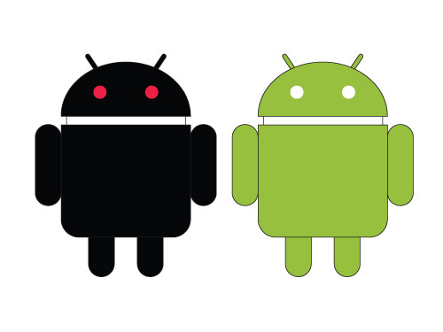
Back to the progress! This is what a finished, cooled off, assembled and completely naked Android looks like. Please try not to stare.

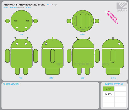
That is much better. The standard green Android is a pretty straight-forward matter of spray-painting the correct colors in the correct areas. The more interesting part here is that little strip of color swatches on the right.

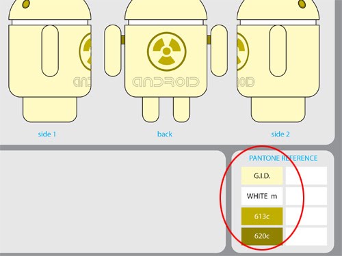
All you non-designers out there may not be familiar with how hard it is to match ‘on-screen’ colors to ‘real world’ colors. Those color swatches are part of an industry-wide color reference system from PANTONE. Basically the factory has a copy of that book, I have a copy of the same book, and we can all agree on what the final color should look like without having to worry about anyone properly color-calibrating monitors or printers between offices (and countries). In every design file for each Android variation I make note of which specific color codes to reference (by the way, Android green is PANTONE code 376!).

For designs that go beyond basic painting we turn to the mighty machine for assistance. This one is called a “pad printer”, because it uses rubber pads to transfer paint onto curved and irregular surfaces. The artwork is etched onto the pad much like a traditional rubber stamp, but this pad is much softer. When the pad is pulled down onto the Android it deforms over the shape, depositing the paint in all the right places (hopefully).

Despite all the metal, this is still a mostly manual operation. The operator has to be quite skilled in order to line up all of the tiny details on the more complex designs. Some of the Androids use dozens of different pads in conjunction with complicated spray paint masks.

Next Time: Shape up, ship out and party down!

Android mini production – Part 2: design layout

Hello again everyone! Last time we were laying the groundwork for the project to move forward, now the real fun begins as a final figure is fleshed out.

Once we had settled on the basic design, I created this line art “turnaround” reference. This layout includes basic scale measurements and detail notations for the sculptor as well as joint notations for the factory. It was also the first time I was able to show the rest of the guys working on the project exactly what I had in mind from all angles… which meant this was the first time that they had seen their mascot with my “fat” legs design.

This naturally lead to a discussion on the best way to create a compelling figure while staying as true to form as possible. Using brand-accurate rounded cylindrical legs would pose a problem, our little Android wouldn’t be able to stand up on his own! Being an avid collector myself, figures flopping over and taking Olympic caliber Shelf Dives is one of my pet peeves. The collector in me also knew that a stand is usually just an extraneous piece of plastic bound to be lost or broken. So I presented the team with a number of options including the above “fat” leg, which is brand-accurate from the front and at an angle, but not from the side; a short-round leg which was cylindrical, but had to be comically short to maintain a low center of gravity; and thin semi-rounded legs that could be longer, but would need to be angled to create a more stable triangular base.

Here is the final template, you can see which legs won in the end! I am still confident that this was the best balance of brand accuracy and real-world practicality. You can see on the lower right an area marked “Pantone reference”. For those unfamiliar with design in general, Pantone is an industry standard color reference guide. On-screen colors are often quite different from physical paint colors, so it is important to have an agreed-upon color goal. Typically a designer will have a book of color swatches and a factory will have the same book along with a formula guide to reproduce that exact color in paint.

Ok, maybe NOW the real fun has started. Designs are roughed out, refined and placed into the standard layout template. Here’s an edition of Creature Android that was a little too busy, we dropped the cityscape and the flames, but most of the design remained intact through the final round. Some other designs weren’t so lucky…

This guy never made it past revision 1. With plenty of design ideas around and a limited number we could produce, it was important to balance variety, novelty and fun. There were some good designs that hit the Series 1 cutting room floor, but hopefully we’ll be able to revisit a few of those in the future!

Next Installment: Sculpting, packaging.

Android mini production – Part 1: groundwork

While we all sit quietly and wait patiently for the next shipment of Android Series 1 mini figures to arrive, I thought I would entertain / inform you with a series of posts chronicling the creation of these little guys from start to finish!

It all started with this logo and a couple of designers working on the Android platform. Like many designers these days, they had become fans of the growing genre of limited edition vinyl figures created by artists specifically for an art-collecting adult audience. With a great mascot, a love of all things collectible, and a desire to do something cool, they set about to bring their idea to life.

Luckily another friend of theirs at Android happened to know someone with experience in vinyl collectible production, which is where I came in!

At the end of 2008 we started talking about the best way to go from logo to collectible. Could we adjust Android to an existing platform? Should we do a large expensive collectible? Can they all have different heads? Would a mini series be cool? Is blind box a fun format for tech centric people who may not be as familiar with the concept as traditional toy collectors? During the course of our discussions I threw together this mock-up of what a figure of the logo could actually look like.

It seemed that we were heading in the right direction with a multiple design mini series. I quickly created a set of simple concepts to illustrate that a series would give us the opportunity to create a variety of designs and showcase the versatility of their deceptively simple mascot. Even though these were early concepts, you can see that a few of the ideas and design elements made it all the way to the final products. Some designs (such as BSOD-BOT shown here) were scrapped for pretty obvious PR / legal reasons. Still, it was worth a shot!

With the concept hammered out and an OK from the big Android himself Andy Rubin, the project was a go! We were all set to create a mini series with a relatively small budget for a small quantity of figures destined for internal promotions and giveaways. Yes, originally these guys were not necessarily going to find their way into the hands of fans and collectors (and some of you would argue that they still haven’t!). This was shaping up to be a fun project, and I knew it would have some appeal in the world at large, although how much appeal was hard to judge. Selling collectibles based on mobile operating systems was an untested market to say the least. Thanks to the enthusiasm (and legal wrangling) of the guys at Android, we were able to work out a deal wherein I could produce a few more units to be sold directly to fans and shops.

Next Installment: Getting down to business on design.